To plot a GDP time series (as in the slides of the introductory chapter of the course, here, in French) one first has to find and download some data. As in the course, I use the Maddison Project Database, which provides (very) long run data on GDP and population for more than 160 countries1. To download the data, which come as an Excel file, I use a small Python script:
import urllib.request as url
MADDISON = 'mpd2020'
MADDISON_PATH = 'https://www.rug.nl/ggdc/historicaldevelopment/maddison/data/'+MADDISON+'.xlsx'
File = url.urlopen(MADDISON_PATH)
data = File.read()
with open('./'+MADDISON+'.xlsx', 'wb') as f:
    f.write(data)
This script downloads an Excel file from the Maddison Project Database website
and saves it locally on my disk. Since I do not like Excel files, I convert the
file mpd2020.xlsx into a csv (Comma Separated Values) text file:
import pandas as pd
data = pd.read_excel(MADDISON+'.xlsx', 'Full data', dtype=str, index_col=None)
data.to_csv(MADDISON+'.csv', encoding='utf-8', index=False)
The file mpd2020.csv is saved to disk. It is a text file (which you can
therefore read with any text editor, or process programmatically, for instance
to build charts). The file contains a table. The first column gives a
three-letter country code, the second the name of the country, the third the
year, the fourth GDP per capita (in 2011 dollars) and the fifth the population
in thousands. For instance, rows 2 to 73 contain observations for Afghanistan
from 1820 to 2018. Note that the years are not necessarily consecutive (it
depends on the country and the period) and that more or less data are
available depending on the country (it depends on the history and culture of
the country, more or less inclined towards statistics).
In the course, I produced the charts with Matlab, a scientific computing language (the codes used for the charts of the course are available here). This software is proprietary and not free. Here I show how to use Python (and the matplotlib library) to produce these charts. As an example, I will plot the evolution of real GDP per capita in France.
Let us start by extracting from data (this object is what is called a
dataframe and holds all the data) the observations for France. You can
display the observations for France by selecting the corresponding rows as
follows:
data[data["countrycode"]=="FRA"]
The extract contains
711 observations, and
GDP per capita is observed annually from 1280 (that is, from the time of
Philip III the Bold, son of Saint Louis) to 1789, then again from 1820
onwards. The file contains no observation between these two dates, thirty
years covering the Revolution, the Empire and the beginning of the
Restoration, and since the corresponding rows are missing rather than filled
with NaN, the chart below bridges the gap with a straight line segment.
Population is only observed annually from 1820 onwards. To plot this time
series, one uses the matplotlib library (there are other plotting libraries
which might let you obtain charts more to your taste):
import matplotlib.pyplot as plt
# Select the data for France from 1280 onwards
DATA = data[(data["countrycode"]=="FRA") & (data["year"].astype(int)>=1280)][["year","gdppc"]]
# Convert the data to numeric values (so far they are character strings)
DATA["year"] = pd.to_numeric(DATA["year"])
DATA["gdppc"] = pd.to_numeric(DATA["gdppc"])
# Plot
DATA.plot(x="year",y="gdppc")
plt.savefig("gdppc-fr.svg", transparent=True)
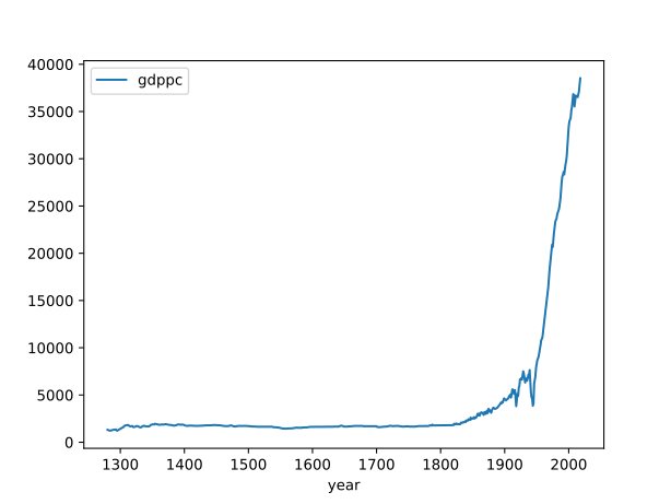
Figure 1: GDP per capita in France since 1280.
One observes that not much happens until the beginning of the 19th century. Here the chart shows the level of GDP per capita; it would be more appropriate to display the natural logarithm of GDP per capita (to smooth out the explosive behaviour of the variable from the middle of the 19th century onwards, and possibly to get a better view of the fluctuations of GDP before 1820).
Footnotes:
Data over very long periods, more than a century, are only available for a limited number of countries